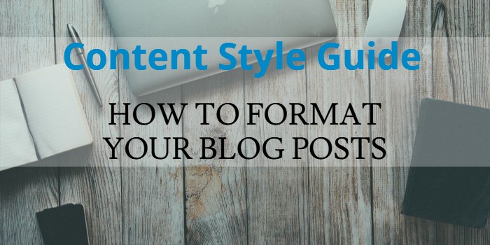
Does your website or blog follow a content style guide?
If your readers are important to you, then it should.
Let me explain:
The way you format your blog posts can affect the length of time a visitor will spend reading it.
Why?
Because the way people approach reading a blog differs from the way they’d read a book. They’re easily distracted so they need a formatting style that’s easy to read, easy to follow and that will keep their attention.
Think about it. When you’re on the Internet, you’re surrounded by distractions. Notifications are everywhere, Facebook, Twitter, Skype, etc.

No matter what your visitor’s screen size, your content needs to be visually appealing. This will decrease your bounce rate and give a better, more enjoyable user experience.
Plus, having a consistent formatting style throughout your blog gives the perception of quality and professionalism that should help to build your authority.
At the end of the day, if you’re taking the time to write great content, do yourself a favour and format it well too. What good is great content if no one stays to read it?
Tips for Formatting Your Blog Content
Now you know it’s important to format your blog content for optimal readability, here are some guidelines to help you do just that:
- Make your content scannable – People are much more likely to scan a post for the information they need, rather than read it in its entirety. Help your audience find what they’re looking for by providing visual cues, headings and sub-headings, lists, pictures, borders and boxes, bold font etc.
- Consistent style and structure – Let’s face it, a messy blog with no flow looks unprofessional. If your website doesn’t show quality then why would anyone take what you have to say seriously?
- Consistent tone, grammar, and punctuation – If done correctly, these details will go unnoticed by your readers. Your content will flow nicely and they’ll have an enjoyable reading experience.
- Provide a call to action – What do you want your visitors to do next? Leave a comment, subscribe to your email list, follow you on social media, view the next post in the series, buy your product? You should guide your visitor towards the next step, otherwise, you run the risk of them leaving once they’re done reading your post.
Use a Content Style Guide
If you’re going to build a team that will contribute to your blog or if you plan to publish guest posts, you must provide guidelines to help your writers. For ease, direct them to a content style guide.
A content style guide is a document that provides a set of rules which when followed will create consistent, unified content to help establish brand presence.
In fact, if you’re the only writer for your website, a content style guide is still handy to keep nearby for reference. Trust me, I often refer to mine when editing my posts.
To simplify this process for your website, you could refer your writers to an external manual. Here are popular content style guide examples:
- Wikipedia: Content Style Guide Examples
- The Columbia Guide to Online Style
- The Yahoo! Style Guide: The Ultimate Sourcebook for Writing, Editing, and Creating Content for the Digital World
- The Elements of Style
- Microsoft Manual of Style: Your Everyday Guide to Usage, Terminology, and Style for Professional Technical Communications
- The Chicago Manual of Style
- The Associated Press Stylebook 2018: and Briefing on Media Law
- The New York Times Manual of Style and Usage: The Official Style Guide Used by the Writers and Editors of the World’s Most Authoritative News Organization
If you take the simplified route and go with an external content style guide, it’s likely you’ll not want to follow it 100%. If that’s the case, simply list the differences in your websites content style guide.
Remember that style guides are references, consulted when a question or problem arises, rather than books to be read as a training tool. Jean Hollis Weber
A good place to start is remembering to direct the writers to your chosen content style guide. I also recommend supplying a checklist they can study and refer to when necessary.
I start with a Table of Contents so that my readers can easily navigate to the section(s) they need, as you’ll see below.
Attention: Want a printable version of this post? Click Here
Internet Habits – Content Style Guide
When creating content for this blog, there’s a lot more to it than writing skills. The posts formatting and appearance is also extremely important.
Blog posts should start strong to engage the reader and draw them into the rest of the content. It’s also important they end strong to encourage the reader to take action.
The following should act as a reference guide when putting together an article for this blog:
- Headings / Subheadings
- Styling Posts
- Grammar, Punctuation & Tone
- Colour
- Highlight
- Nouns and Pronouns
- Images
- Feature Images
- Embedding Videos
- Cite Sources
- White Space / Clutter
- Link Paragraphs / Sections
- Call to Action on Their Own Line
- Low Engagement Call to Actions
- Final Call to Action
- Prompt for Comments
- Category
- Custom Excerpt
- Related Posts
Headings / Subheadings
Your heading should try to entice readers into the post. It should be short, catchy, and error-free. You should also try to include your keywords in it if possible.
Use subheadings to guide your audience through your post. They should outline your content and advertise that section to help your visitors decide whether they’ll take the time to read it.
Write subheads to catch your readers attention. This will help engage those that are just scanning your post and draw them into the rest of the content.

To make sure readers can easily spot each section of your post at a glance, the font size used for the subheadings should be large enough to differ from the main content.
You should also consider numbering your sub-heads if the post is long. It will make the reader feel like they are making progress as they work their way through the mass of content.
To provide consistency, write headings using uppercase and subheadings using title case. Title case means that the first letter of each word is a capital, except for certain small words.
Styling Posts
Blog posts should not look like a wall of text.
To emphasise this point again, online readers rarely read content word for word, they scan. You must break up your content to capture their attention.
Use the following options to break up your posts:
- Subheadings
- Short Paragraphs
- Images
- Bullet Points
- Numbered Lists
- Bold or Italic Text
- Blockquotes
Option #1: Subheadings
Subheadings should make each major section of the post stand out. The subheading should use <h2> tags. If you need a subheading within a <h2> tag then you should use a <h3> tag. Further subheadings within these tags should use <h4> tags, although it’s unlikely you’ll need these unless you have a very lengthy post.
To simplify header tags:
- H1 is for the title
- H2 is for any subtitles
- H3 is for any sub-subtitles
- H4 is for any sub-sub-subtitles (very unlikely you’ll need these)
Option #2: Short Paragraphs
To try to keep readers from leaving the blog, limit paragraphs to 5 or 6 lines. Stick to this limit for better readability. It will also benefit smaller screens on mobile devices.
You can use one sentence paragraphs if you want your point to stand out.
Option #3: Images
Images should relate to the topic of the post. They should keep readers engaged and help draw their eyes down the page.
Where possible, place images by your key points as this should help to captivate the visitors. You can try to enhance this further by telling a story or joke with the image.

Option #4: Bullet Points
Bullet points should:
- Provide a list of concepts or information on the current topic
- Prevent paragraphs from becoming too long
- Summarise the main points you’re trying to get across
- Do all the above in a way that’s easy to digest
See what I did there? 😉
Option #5: Numbered Lists
These should describe processes, i.e., a list of things to do, or points to consider.
Option #6: Bold or Italic Text
Use bold text to make certain key words, phrases, or sentences stand out.
Use italic text in a similar way to bold text, to put emphasis on a word or phrase. Write questions in italics to make the content seem personalised.
Overuse neither of these.
Option #7: Blockquotes
Use blockquotes to emphasise quotes relevant to the topic.
People will stare. Make it worth their while. Harry Winston
Grammar, Punctuation & Tone
I’ll be honest, grammar and punctuation aren’t my strongest points. Those of you that are critical may have discovered several mistakes on this blog already.
The good news is that when writing online, you don’t have to be perfect. You just have to get your message across to your audience.
Here are several rules I try to follow:
Hyphens & Dashes
Hyphens: The narrowest of the three (-). Use these to join words in a compound construction (e.g., free-range).
Em-dashes: These are the width of the letter “m” (—). Use these in the place of commas, parentheses, or colons. To avoid confusion, use the em-dash in moderation, particularly in a single sentence.
Mac: Hold Opt, Shift and press the hyphen key
HTML: —
En-dashes: These are the width of the letter “n” (–). Use these to connect values in a span or range. The en-dash should read as “to” or “through” (e.g., 1983–1999).
Mac: Hold Opt and press the hyphen key
HTML: –
Note: WordPress will create em-dashes and en-dashes by typing two or three hyphens in a row. Three hyphens will always result in an em-dash.
Unfortunately, two hyphens can produce both an em-dash and an en-dash. It depends whether you include a space either side of the hyphens. A hyphen with a space either side will also create an en-dash.
Semicolons & Colons
Semicolon: The best description I’ve seen for a semicolon is that it’s stronger than a comma but weaker than a period. For this blog, its use is for that purpose.
Colons: Use a colon when introducing a list, or between two independent clauses when the second explains or illustrates the first.
They also have non-grammatical uses such as when they show the time, ratios, or references (e.g., 10:30 a.m., 1:4, Proverbs 14:23).
Other Punctuation
Exclamation Point: I have one simple rule for these, use them in moderation!
Quotation Marks: The main use of quotation marks is straightforward, to quote the words of others.
Some other uses include: referring to a specific word or letter and scare quotes.
Ellipses: An ellipsis is a series of three periods (. . .) that usually indicates an omission. Ellipses can also show an unfinished thought, hesitation, or awkward silence.
Numbers
How to display numbers on a blog can vary a lot. I spell out all numbers that need two words or fewer. I make exceptions for headings, sub-headings, and where I believe numerals will get my point across better.
Write figures that have four or more digits with commas. To place the first comma, count three digits to the left of the last digit (do not count those that follow a decimal point). Continue to place commas after every three digits (e.g., 8,701 or 12,345.67).
Abbreviations & Acronyms
There’s one rule for abbreviations and acronyms; the first reference must have the title spelt out followed by the abbreviation/acronym in parentheses. All proceeding references can be abbreviated.
For example, you would first refer to Search Engine Optimisation (SEO) like I just did and then all other times you need to mention it, you can use the abbreviated version, SEO.

However, as people often scan blog posts, they may miss the first reference so it’s a good idea to use the none abbreviated version several times throughout the post.
Tone
The tone of the blog describes how you want your content to appear. My preference for this blog is to present a tone that’s: conversational, educational, laid back, humorous, and occasionally controversial.
Colour
Colour is simple as far as readability goes. Your text should be dark and the background should be light, such as black text on a white background.
I’ve seen some terrible colour combinations in my time. One of the worst was yellow text on a light coloured background. Do you see my point? If your text is difficult to read, your visitors won’t hang around for long.
Highlight
The reason you highlight anything is to make it stand out. With blogging, you should make your important information jump out at your readers.
If your readers are just scanning your posts, there’s a strong chance they’ll stop and read the information that stands out. This could be a heading, sub-heading, text you’ve made bold, or even highlighted text.
If you’ve done your job correctly, this will entice your visitors to read the rest of the post, or at least leave having learnt something.
Nouns and Pronouns
I’ll keep this point as simple as possible. Try not to use pronouns in your blog posts unless you’re referring to yourself or the reader. This allows for a conversational style of writing which will pull your readers into the discussion and engage them better.
A noun is the name of a person, place, thing, or idea.
A pronoun (he, she, they, etc.,) is a word that takes the place of a noun.
Pronoun example: Him and Her instead of Jack and Jill.
The reason you should avoid pronouns is to benefit the readers that are scanning your text. What if they begin reading part way through your content? The pronouns won’t help them.
Using nouns will benefit your readers and should also help the search engines to understand what your content is about.
Images
I could write an entire blog post for this section with the number of elements to consider for images. Don’t worry though, I’ll keep it as brief as possible.
It’s pointless putting effort into formatting your writing if you don’t take similar care of your images. A consistent writing style should pair with a consistent image style.

Here are a few rules to follow:
- Images should relate to the post or the point you are trying to make. Do not just include an image for the sake of it
- Make sure the image file size isn’t too big. Try to keep them under 100KB as a maximum
- Use descriptive file names for your images (e.g., consistency-is-key.jpg)
- Enter descriptive alt text for your images to make sure they are accessible to text and screen readers (e.g., Keys under the text Consistency is key)
- If images aren’t full width, align them centrally or to the right only
- When aligned to the right, enter enough text alongside the image so it sits flush with the bottom image. Ok, maybe I’m fussy but I think this looks better!
- Never use poor quality images
When selecting the image(s) to use, make sure they are free to use and available for commercial purposes. You also need to make sure you have the rights to modify the images.
The reason you want to modify the image(s) is that otherwise, you risk using an image that’s been used hundreds, if not thousands of times before on other websites.
Another reason is a lot of stock images look too perfect. They lack credibility and are more likely to be ignored.
If you find an image and you are not sure if you’re allowed to use it, locate its original source and check the license. If you can’t find this information, do not use that image.
Here is a list of my favourite websites where you can look for approved images:
- Unsplash
- Pixabay
- Creative Commons Search
- Flickr Creative Commons
- Picjumbo
- Compfight
- PhotoPin
- IM Free
- Free Images
- Stocksnap.io
- Picography
- Splitshire
- Jay Mantri
- Icon Finder
When modifying your image(s), it can be as easy as applying these three simple steps to create a unique image that promotes your brand:
- Crop your image and consider reframing it
- Add a filter and/or overlay
- Add text and your logo
If you don’t own software such as Photoshop, don’t worry, there’s plenty of online tools you can use to get the job done. A few I recommend are:
If possible always credit image authors. Depending on the license, this may not always be necessary but I as there’s no harm in giving people credit for their efforts, I believe it’s a step worth taking.
Do this at the bottom of your post by displaying the attribution in the following format:
Image Credit(s): Author Name, via Unsplash, Picography, etc. (You should link the author’s name to the image resource or their website)
Feature Images
All posts on this blog must include a feature image that relates to the topic of the post.
For reference, the dimensions for feature images are 700px by 350px.
Not only are images a great way to help captivate your readers, they also optimise your content for sharing on social networks.
Having your image appear in a news feed will draw more attention to it, plus it will increase the chances of people clicking through to your post.
Embedding Videos
Videos are another great way to break up your posts and catch your reader’s attention.
I embed videos into posts using iFrame with a maximum width equal to the post content for this blog.
There is no problem embedding videos into your posts with the hosts’ default player, i.e. YouTube, Vimeo, Wistia, etc.
However, I occasionally use a few tools on Internet Habits that allow me to insert videos with extra functionality.
If you’re interested in what these are, you can read more about them and other video players in the Video section of my Resources page.
Cite Sources
If you include information in your blog post you found somewhere else, please make sure you give credit to the original author.
There are several ways to do this. A simple solution is to make it clear where the information came from and include a link to the source.
Here’s an example:
That link, however, should not just go to their homepage. Point that link to the actual page on which that data lives. This is for the benefit of the reader, too, so they can dig into the research more if they’re so inclined. Corey Wainwright
Oh, and one final thing on citations…
Please make sure you have permission to use the information before including it in your posts.
White Space / Clutter
You’ll notice that there’s plenty of white space on this blog and that it’s clutter-free. That is not a mistake.
By making sure that the blog is not too busy, it prevents overwhelm. It should also help draw your readers eyes to the more important stuff, your content.
Link Paragraphs / Sections
To make sure that blog posts flow and make sense to your readers, your paragraphs and the sections of your blog post should link together.
The end of one paragraph should tie in with the start of the next. This will provide your blog posts with structure.
Do your best to stick to this rule to supply your visitors with content that is easier to follow.
Call to Action on Their Own Line
Place call to actions strategically within your posts.
To increase the click-through rate, place important call to actions on their own line rather than in the body of the text.
Attention: Want a printable version of this post? Click Here
Low Engagement Call to Actions
Place low engagement call to actions such as requesting a social share or email opt‑in in moderation throughout the content.
Don’t overdo these as they can get annoying.
Final Call to Action
Place your most important call to action towards the end of your post. Someone has just spent their valuable time reading your content (or skipped to the end), so whilst you have their attention, tell them what to do next.
Prompt for Comments
At the end of your post, ask the readers a question to encourage comments.

Not only do comments allow you to interact with your audience and provide even more value, a post with a high number of comments will arouse interest and attract more people to open your content.
Category
Not all visitors will have an interest in everything you write, but they may have an interest in a certain topic. By setting up categories for your blog, the information that your reader desires will be easier to find.
When writing for this blog, select a maximum of three categories.
Custom Excerpt
This is an important piece of text because it’s seen on search engines and social media sites.
Make sure that the post’s custom excerpt is brief yet intriguing to lure visitors in from the aforementioned sites.
Related Posts
This part is straightforward. The related posts that appear at the end of your post should relate to the content in your post. It’s that simple.
On this blog, I currently use the Related Posts feature within the Jetpack plugin. I have it set to display three related posts including the heading and a thumbnail image for each.
This plugin scans all of my posts’ content, analyses it, and then uses that to display related posts my visitors might also be interested in reading once they’re finished with the current post.
The reason I chose this related posts plugin is that unlike most related post plugins, Jetpack does all the analysis, processing, and serving from their cloud, so there’s no additional load on my hosting server.
Update: I now have a solution in place that allows me to search and assign up to three related articles per blog post. I prefer this method as it means I can look after my audience better. I’d rather not rely on an algorithm to select the related content for my readers.
Additional work? Yep.
Worth it? Definitely!
If you decide to make use of related posts on your blog, once your audience has finished reading (or scanning) your article, they’ll have extra reading material to keep them hooked on your content that is just a click away.
Conclusion
So there you have it, the reasons why it’s so important to follow a content style guide and the steps I take to format all my blog posts on this website.
Does the layout of your content illustrate quality and professionalism?
If the answer is no, take action.
Improve the readability of your blog by applying some of the above recommendations to your future posts.
Has following a content style guide improved your results?
I’m interested to hear your thoughts. Leave a comment below and share your favourite formatting tips.
Attention: Want a printable version of this post? Click Here
Image Credit(s): Gerd Altmann, Johny Deff & Werner Moser via Pixabay, Jokideo, Dustin Lee via Unsplash


